
This transformation, which has already begun to roll out on some platforms, according to 9to5Google, responds to the accumulated criticism about the difficulty of differentiating apps and to the need to reflect the integration of new AI-driven features.
The new generation of icons is characterized by the use of gradient effects and disclaiming the obligation to include the four classic Google colors in all cases. The design uses gradients similar to those already seen in Gemini, Home, Photos and Maps, creating a visual consistency that emphasizes the presence of AI-powered features.
One of the most noticeable changes is the disappearance of the page-shaped background or container that was present in previous versions, allowing the icons to be larger, distinctive and readable. Each application receives a special chromatic treatment, facilitating immediate identification without having to stop to analyze details.
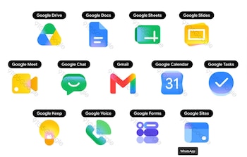
for example The Google Drive icon ditches the red color and keeps only green, yellow and blue, coincides with programs for editing documents. The outer triangle has a more rounded shape, while the center remains sharp.
In the case of Documents, Tables and Slides, each maintains a predominant color: blue for documents, green for tables, and yellow for slides. In addition, Tables and Slides icons are changed to a horizontal format according to the interface and the actual use of the applications.
Google Meet represents a significant transformation. Although the icon still displays a video camera, the yellow color is now dominant.
For his part, Google Chat uses a pill-shaped message bubble with a green smiley that resembles Hangouts. This change seeks to convey intimacy and ease of use by visually integrating with Google’s other communication tools.
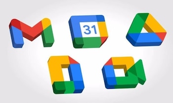
The case of gmail, The “M”-shaped envelope retains its essence, but gains roundness and clarity. The predominant color is red, although small doses of yellow, green and blue are preserved. This makes the Gmail icon the only one in the new series that continues to display all four Google colors, reinforcing its unique identity among apps.
As for Google Calendar, the icon reverts to a design that references the old console leaf calendarseliminating the multi-colored container and restoring the classic blue. The gesture is a nod to the app’s visual history, making it instantly recognizable.
With this redesign, Google is addressing one of the most persistent criticisms in recent years: excessive similarity between icons, which created confusion and made it difficult to identify each app.
The goal of these changes is to allow users to easily and quickly identify each application, improving the user experience in environments where multiple visually similar tools coexist. The new design also aims to reflect the integration of artificial intelligence capabilities in the set, combining visual language under the Gemini gradient effect.
According to what has become known, these icons have already started to be implemented in some applications and will soon gradually reach the rest, both in mobile apps and on the web and other places where Google uses its own icon sets.
Although at the moment there is no official date for the full availability of new icons on all platforms, but the changes are inevitable and progressive.