
Google has started a visual update in its applicationsa change that goes far beyond simple aesthetic adjustments. According to 9to5Google, the company is introducing gradients, more distinctive shapes and new color approaches to icons in Google Workspace and other key apps.
This redesign doesn’t just affect devices pixelbut also extends to the Android ecosystem as a whole, marking a new phase in Google’s visual identity and the way users interact with digital tools.
The use of gradients is characteristic of the new visual language and abolishing the requirement to use the four corporate colors on all badges. Each app can now highlight its primary color and shape, making it easier to identify and giving it a more modern look.
The presence of a gradient effect on icons such as Google’s “G”, Gemini, Home, Photos and Maps reflects the integration of features artificial intelligence and a more sophisticated interface approach.
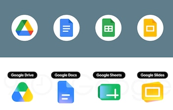
For example, Google Drive ditches the color red and focuses on green, yellow and blue tones, aligning itself with the design of editing programs. Documents, Spreadsheets, and Presentations retain their preferred color and adapt the shape of their icons to the actual layout of the documents: vertical in Documents and horizontal in Tables and Slides.
Gmail continues to use the traditional M-shaped envelope, but is now dominated by red and you can see only subtle touches of Google’s other colors, making it more recognizable.
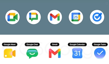
The redesign is also seen in apps like Google Meet, which now has a yellow-centered video camera, and Google Chat, which uses a green message bubble with a smiley face, reminiscent of its Hangouts heritage.
Google Keep highlights the light bulb in more detailremoving the background of the page to simplify the image. In the case of Google Calendar, the classic blue color returns, and the visual reference to the flip calendar reinforces the connection to the physical object.
Forms apps and sites also get a boost, with Google Forms opting for purple-hued multi-choice bubbles, while Google Sites adopts a lighter blue color and horizontal layout reminiscent of its web version a table.

For its part, Google Voice retains the shape of the phone, but now with softer lines and a light green color that harmonizes with the visual language of Chat.
With this redesign, Google aims to make its apps easier to identify and use on both Pixel phones and other devices. Android. The update not only responds to the aesthetic trend, but also aims to improve the user experience, distinguishing each tool with its own function and visual personality.
Additionally, the integration of AI elements into the icons shows a commitment to the future of AI on the platform.
Google Workspaceformerly known as G Suite, is a cloud-based collaboration and productivity platform created by Google. This set of tools enables people, teams and companies to work efficiently from anywhere and on any device by centralizing key functions in a single account.

Its main utilities include connectivity to services such as Gmail for corporate email, Google Meet for video calls and virtual meetings, and Google Chat for instant messaging between team members.
For content creation and editing, Workspace offers Google Docs, Sheets, and Slides for real-time collaborative editing of documents, spreadsheets, and presentations, and Google Forms for creating surveys and forms.
The platform also helps storage and file organization through Google Drive, which allows you to securely store and share information, and Google Calendar, which helps coordinate agendas and schedule meetings.