
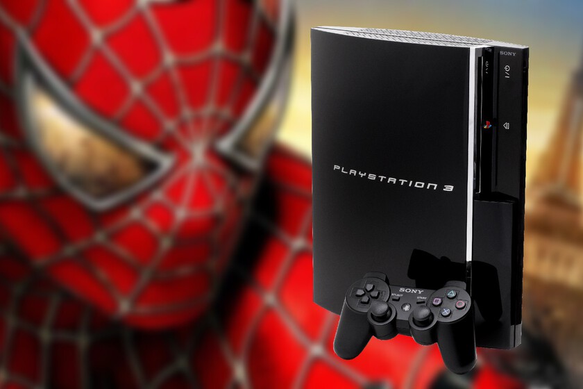
One of the most common questions among PlayStation enthusiasts is why Sony decided to use the font from the Spider-Man movies in the original PS3 logo.
This detail, while obvious to many, is still intriguing as it is a design directly related to a superhero, not the video game industry. The decision was not accidental: there is a creative and strategic rationale behind using the letters from the Spidey movies on the PS3.
History behind the common font
In 2006, when the PlayStation 3 was released, His logo immediately caught the eye for using the same typography as the Spider-Man trilogy. directed by Sam Raimi.
According to Ken Kutaraga, then CEO of Sony Interactive Entertainment and leader of a group that included the likes of Shuhei Yoshida, The choice was based on taking advantage of a recognized brand that was already part of Sony’s visual identity due to its superhero rights: this movement sought to convey a futuristic image in line with the rounded and elegant design of the console.

The font used, known as Mata, is recognizable by its stylized shapeselongated lines and a design that reflects dynamism and, although today it may seem old-fashioned, at the time it inspired modernity. It was created specifically for the Spidey films, appearing in the credits and promotional material for the films released between 2002 and 2007.
however, In 2009, the PlayStation 3 logo was redesigned, replacing the Spider-Man style with a more sober and generic typography. This change was intended to give the console its own identity after the crisis it was going through and distance it from its association with the Spider-Man films, especially as Sony began to restructure its marketing strategies. marketing. The new design was retained until the end of the console’s life.

This interesting chapter in PlayStation design history demonstrates how Seemingly small graphic decisions can have a lasting impact on the perception of a product.
By combining elements from two different industries, Sony not only earned the recognition of Web Head: it also created a cult object that continues to arouse curiosity long after, despite the fact that, at least in the early years , PS3 was not the sales success expected by the company.


